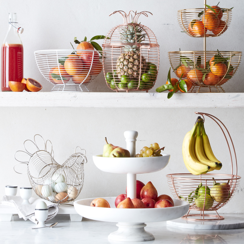
 Surely you’ve heard about the all-white kitchen trend by now, right? It looks clean, helps brightly colored produce pop, and reduces visual clutter.
Among those of you using our #mywilliamssonoma hashtag, in fact, we spied some readers who made elegant, smart use of the trend. Here they are, for your renovation inspiration.
1. A Shimmering Pop
When your kitchen isn’t overwhelmed in shades of gray by gadgets galore, a glowing white backdrop can really help a stainless-steel range, like this one, from La Cornue, glimmer. (Frankly, we’re also gaga for the one in Provence blue.)
2. The Charm of Copper
By the same token, a bit of timeless, glowing copper evokes the French countryside. This ‘grammer made genius use of our copper KitchenAid stand mixer. Adding a few dozen roses in peach and pink sure never hurt the look of a kitchen, either.
3. White on White
Sometimes it’s not about contrast at all, but about white on white, with maybe the barest hints of pastels. This kitchen designer made wise use, too, of the echos of silver in her palette: The mod logo on the Smeg toaster recalls the handles on the cabinet and drawers.
4. Metal and Metallics
Some folks decide to cluster their metals and metallics all in one spot, a glowing bit of warmth in the middle of the otherwise airy, clean, cool kitchen. It works, especially when something as timeless as the Le Creuset tea kettle is involved.
5. Consider Texture
If you’re going to take advantage of copper’s warm glow, why not add texture, too? When the lines are as snowy and clean as they are in this kitchen, a hammered-copper Lagostina pot can add something marvelous to the picture.
6. Pattern Power
Sometimes you can overwhelm a space with patterned rugs, murals, and the like, and often it works, but there’s something soothing about this vignette. Stephanie Farina snagged our Parisian stools, with their sturdy backs and bent-rattan frames, to highlight just how bright and minimalist the rest of her kitchen is.
7. It’s The Little Things
Sometimes the barest hint of color, as subtle as the sea, really cements your otherwise all-white look. (This bevy of blooms doesn’t hurt, either.) This blogger uses white and a bit of silvery grey to set off the pale blue of our Fleur de Sel soap. The vibe it conjures is of the Maine seaside on a spring day, right before a walk on the beach. Does it get any better than that?

4 comments
Suggest any best Interior designs for my home please. I follow your blog from very long time.
Nice ideas shared. I have one thing to share may other people like it.
Best Blenders for Smoothies
Thanks for sharing, amazing looks. One thing i want to share: Best 2 Slice Toasters
[…] (function(d,s,id){var js,fjs=d.getElementsByTagName(s)[0];if(d.getElementById(id))return;js=d.createElement(s);js.id=id;js.src='https://connect.facebook.net/en_US/sdk.js#xfbml=1&appId=249643311490&version=v2.3';fjs.parentNode.insertBefore(js,fjs);}(document,'script','facebook-jssdk')); (adsbygoogle=window.adsbygoogle||[]).push({google_ad_client:"ca-pub-8906354233528871",enable_page_level_ads:true}); Source link […]